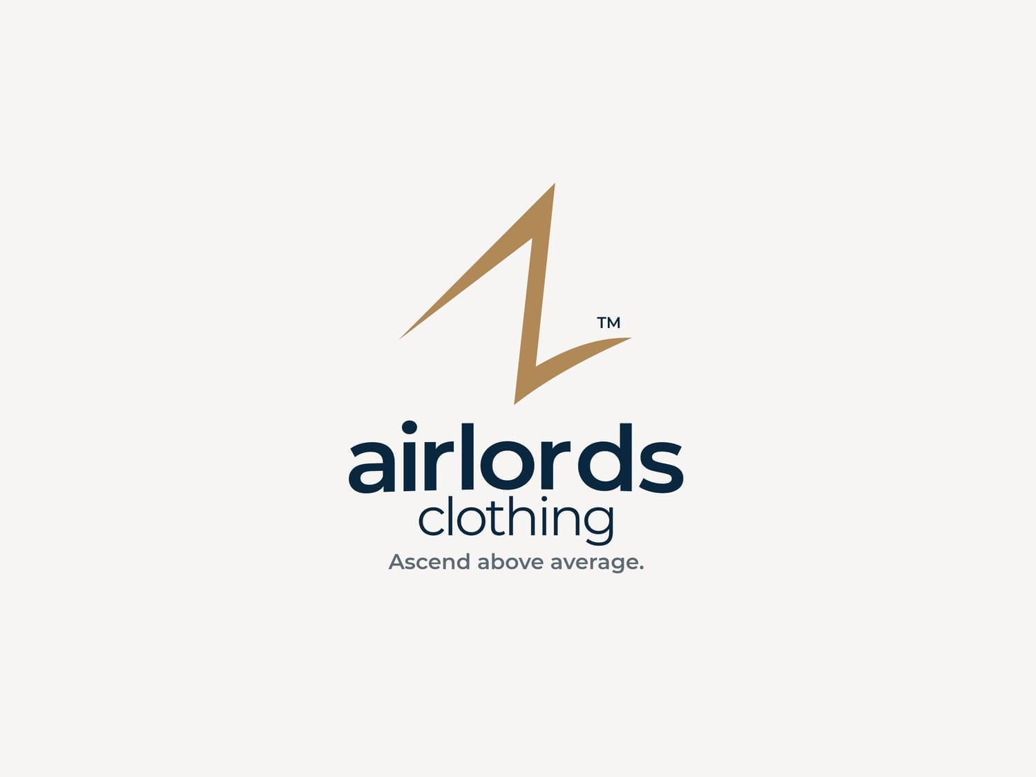
AIRLORDS CLOTHING
Building a premium fashion brand designed to rise above average
How did we help:
Brand Strategy
Visual Identity
Brand Guidelines

Industry
Fashion
Headquarter
Nigeria
Founded
2025
Growth Stage
Startup
The Challenge
Airlords Clothing needed more than a logo. They wanted a brand that communicates confidence, premium quality, and upward movement — something that speaks to individuals who see fashion as a statement, not just clothing.
The goal was to create a brand identity that feels:
Aspirational
Clean
Premium
Globally relevant
Memorable at first glance
The Strategy
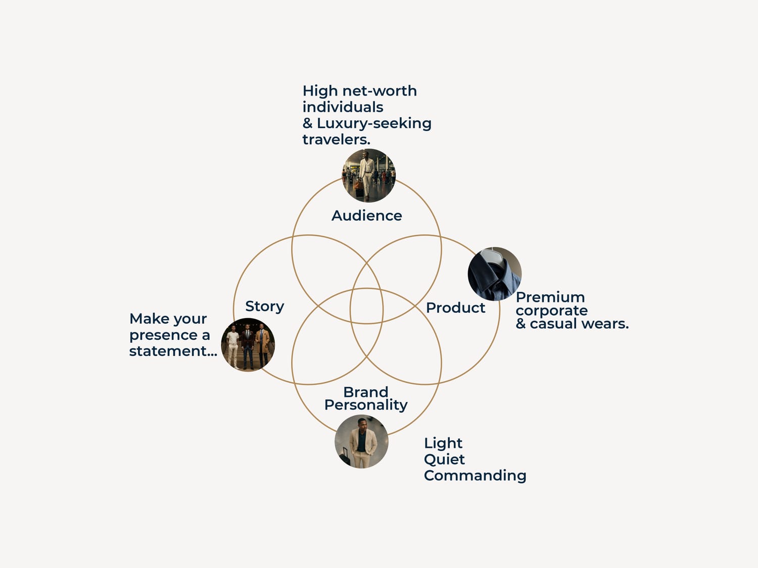
Instead of jumping straight into design, we focused on positioning first.
The brand revolves around one central idea:
Ascending above average.
Everything had to visually reinforce this upward movement — not through noise, but through clarity and controlled elegance.
This meant:
Strong symbolic direction
Minimal but intentional typography
Premium neutral palette
Sharp structured compositions
The brand needed to feel like success in motion.
The Concept
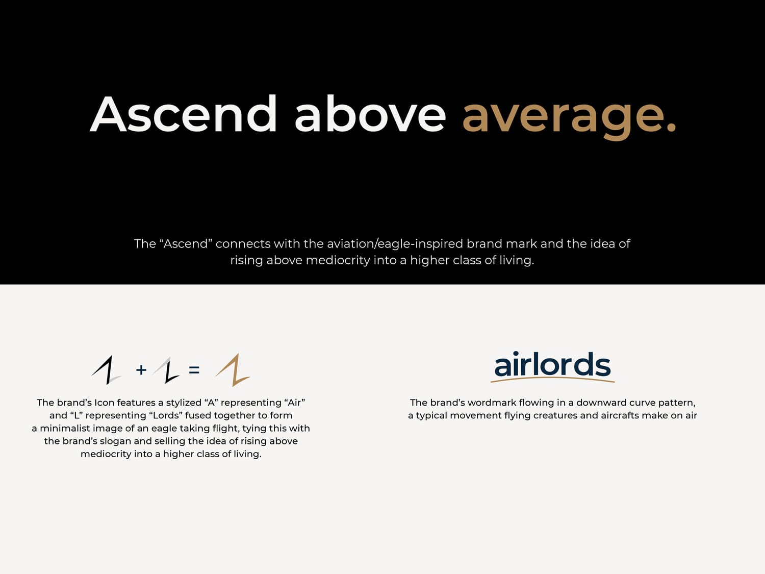
The core symbol was built around the idea of flight and elevation.
Not a literal bird.
Not a cliché wings logo.
Instead, a sharp ascending mark — representing:
Ambition
Movement
Leadership
Personal growth
This keeps the brand timeless and avoids fashion-industry logo clichés.
The result is a symbol that works:
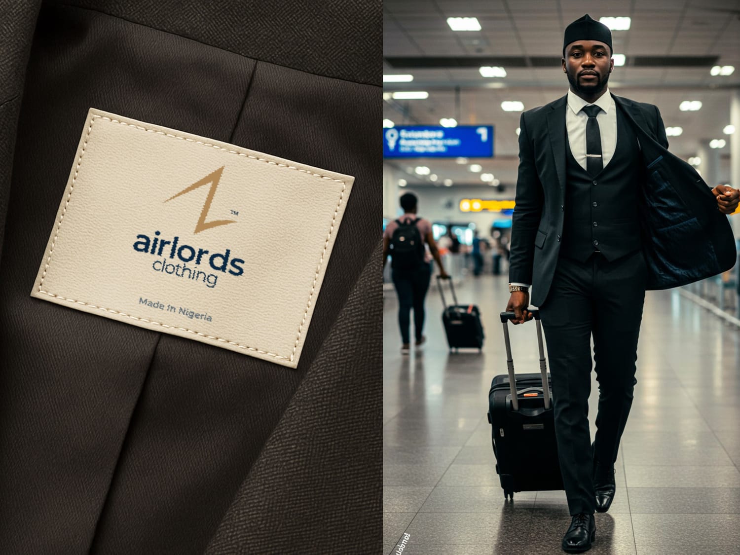
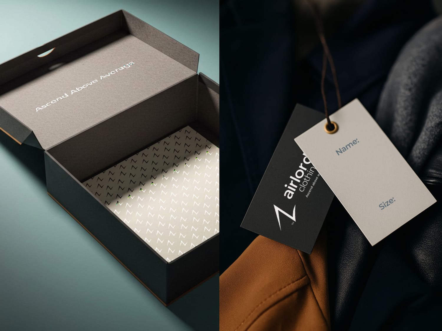
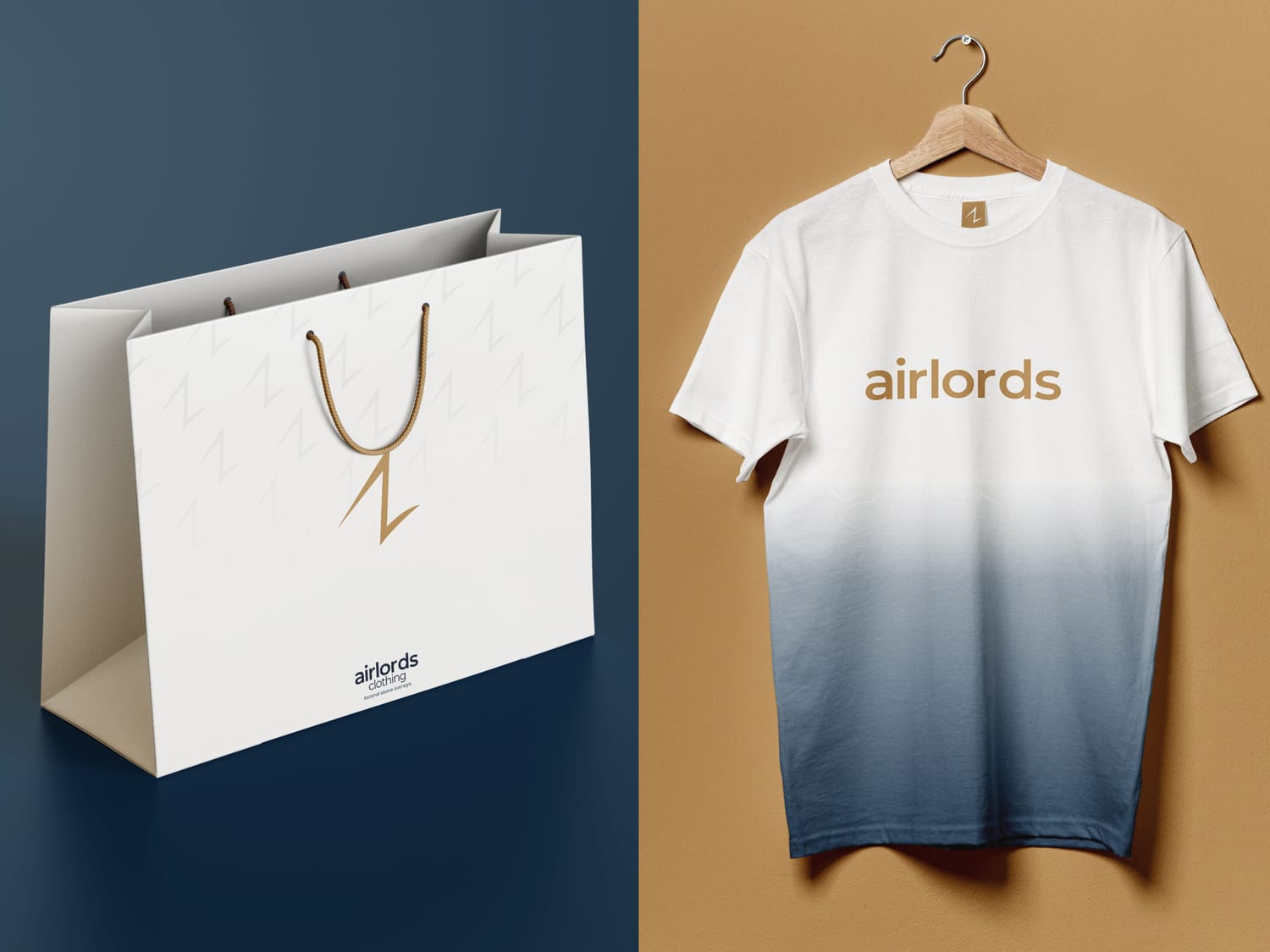
On clothing tags
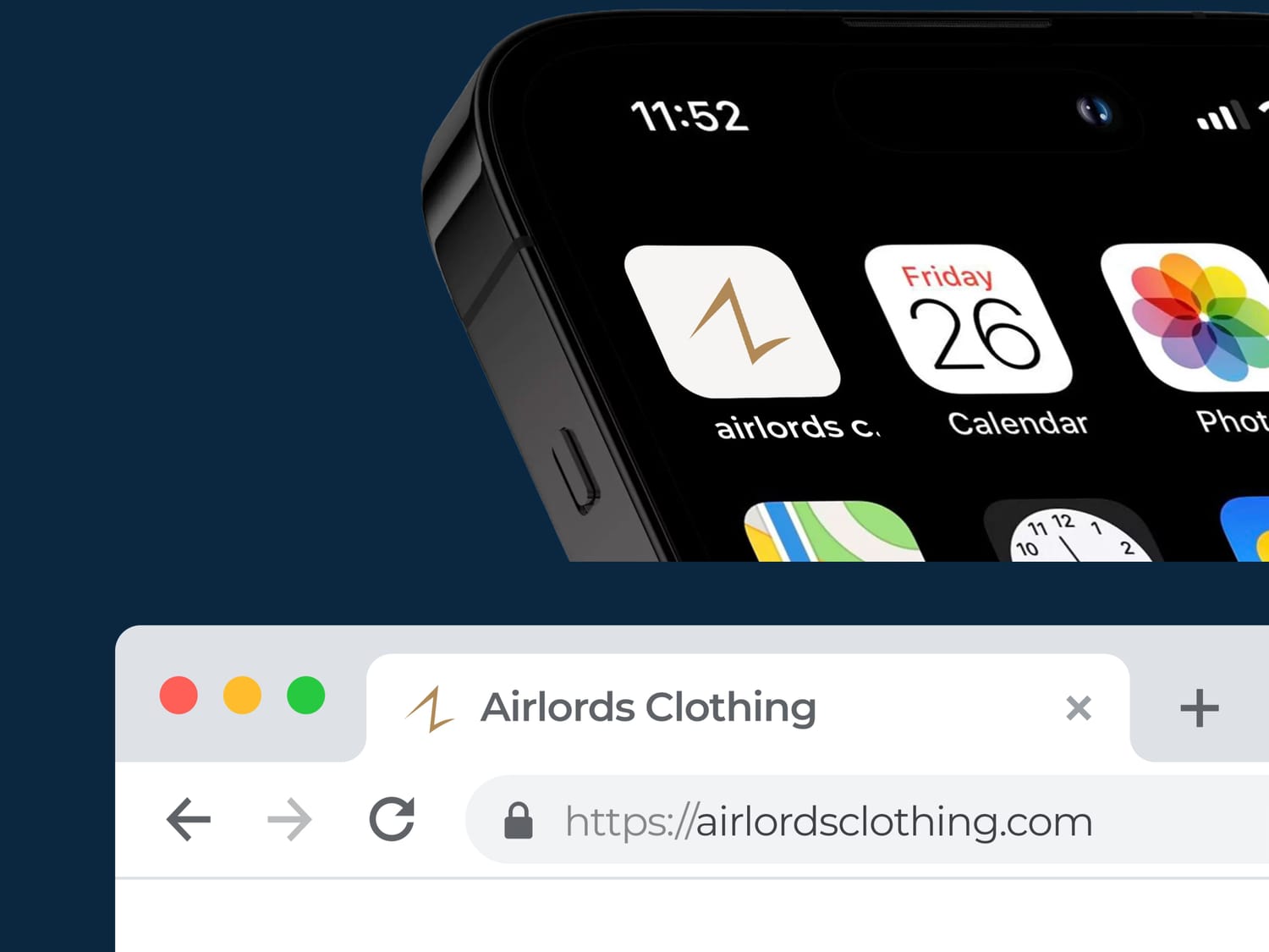
On packaging
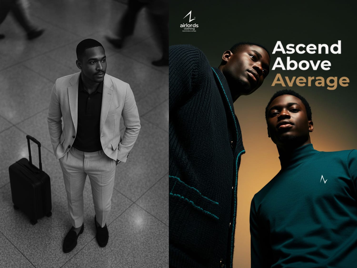
On social media
On large-scale branding
without losing strength.
The Visual Direction
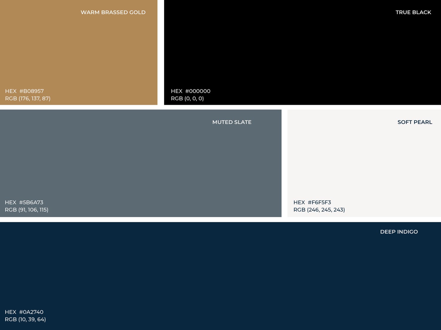
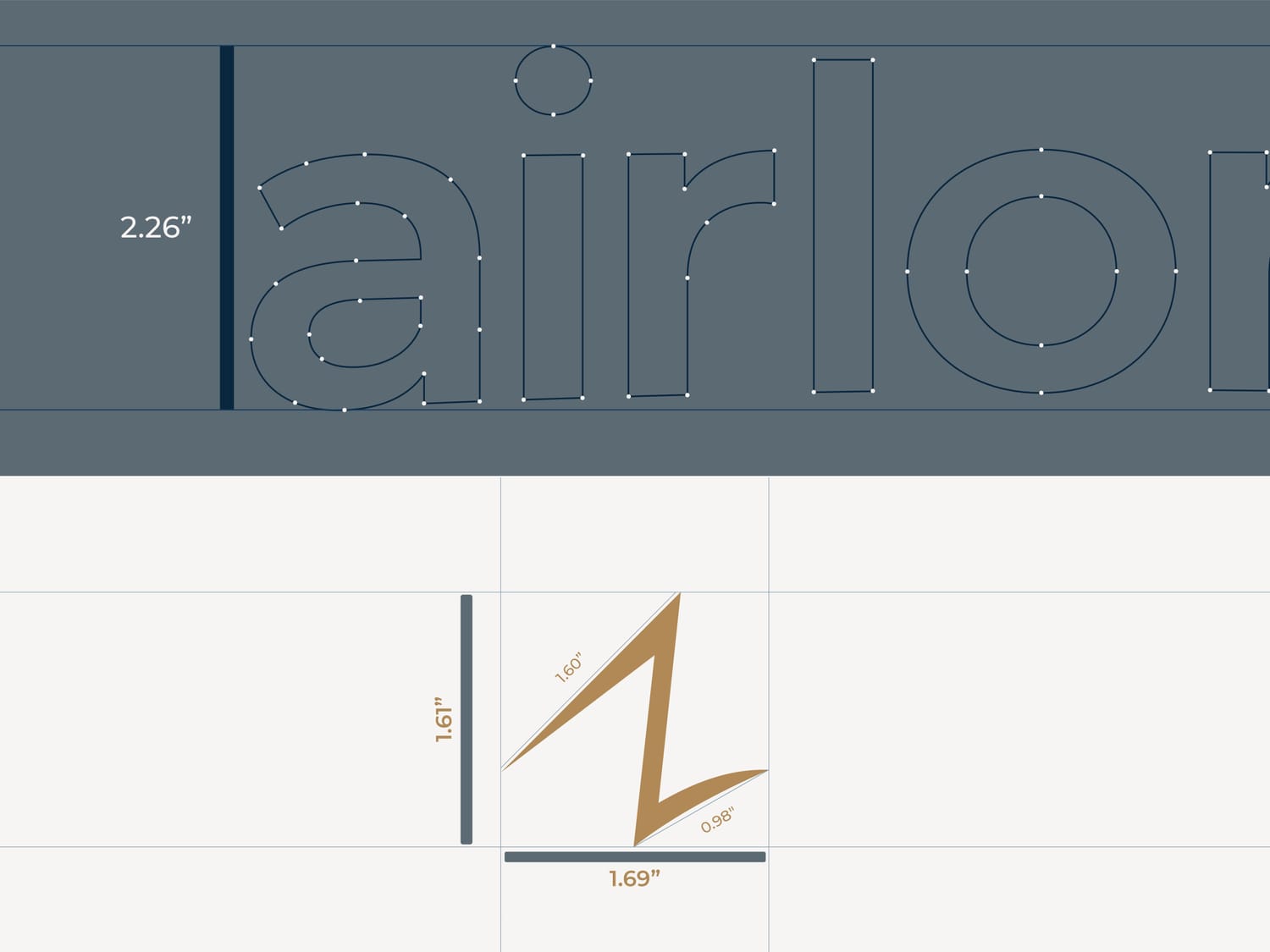
The identity uses a refined premium color system to communicate authority and sophistication.
The typography was selected to balance:
Modern elegance
Readability
International fashion appeal
Every visual element was designed to ensure the brand feels intentional, not decorative.
The Outcome
Airlords Clothing now has a brand identity structured to support:
Premium product positioning
Strong shelf presence
Confident marketing visuals
Long-term brand growth
Because strong brands don’t just look good.
They are built to scale.
You already know something needs to change.
The business is there. The work is real. But somewhere between what you've built and how the world sees it — something isn't connecting.
That gap is exactly what we close.
Related Projects
M-Morris Solar World
M-Morris had a real solution to a problem every Nigerian feels daily. We built the story that made people stop scrolling and start listening.
Market Research
Scripting & VO
Storytelling
Video Ad

Benco Lighting
Benco wasn't just selling lighting. We built a brand that made people feel what they were buying before they bought it.
Brand Strategy
Visual Identity
Brand Guideline
Marketing Materials
Video Commercial
We are a Registered Nigerian design agency dedicated to delivering effective visual solutions that turn visionary African brands into market leaders